Coca-Cola has unveiled a new global visual identity that puts more weight behind the familiar parts of its brand: the red-and-white palette, Spencerian script, Dynamic Ribbon and the red Arden Square that frames the logo. The company announced the system on July 20, 2026, and said it is rolling out across Latin America, Europe, the Middle East and Asia.
The change reaches beyond cans and bottles. Coca-Cola says the visual system will also shape retail displays, coolers and other equipment, digital experiences and advertising, with a goal of making the brand look more consistent across more than 200 markets.
This is a packaging and presentation change, not a reformulation. Coca-Cola’s consumer information in Europe says the recipes for Original Taste and Zero Sugar remain unchanged.
What changed
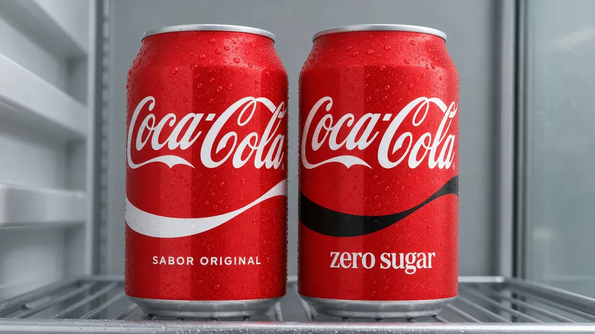
The redesign enlarges the Coca-Cola script and gives the Dynamic Ribbon and Arden Square more visual presence. Original Taste keeps the classic white ribbon against Coca-Cola red, while Zero Sugar moves closer to the same red-led family look.
The Arden Square is the solid red field that holds the white script, while the Dynamic Ribbon is the wave that has appeared across Coca-Cola packaging and advertising for decades. Making both elements more prominent gives the company a repeatable kit that can stretch from a small can to a cooler door or phone screen without creating a different look for each format.
Zero Sugar still has three deliberate signals to separate it from the full-sugar drink: larger “Zero Sugar” wording, a black Dynamic Ribbon on cans and multipacks, and a black cap on plastic and glass bottles. That distinction matters because both core products now lean heavily on the same red-and-white identity.
The company’s Dutch consumer site says the redesign covers Original Taste, Zero Sugar, flavor extensions and multipacks. It also says some other local variants, including Coca-Cola Light and a caffeine-free Zero Sugar product, will retain their existing look in that market. The exact portfolio can vary by country.
Why Coca-Cola is unifying the brand
Coca-Cola describes the project as a way to make every brand appearance feel unmistakably Coca-Cola. In practical terms, one visual system gives local teams and agency partners fewer competing rules to interpret across packaging, stores, screens and campaigns.
The company also introduced an internal Brand Center and what it calls “Design Intelligence” tools to manage the system at scale. Those tools are intended for Coca-Cola’s design and marketing teams and its agency network, adding governance around how the identity is used.
Europa Press reported that Spain received the first European rollout, supported by a “New look. Same taste” campaign developed with WPP. The company’s global announcement did not provide a specific United States launch date.
What shoppers should watch
Old and new packaging may sit beside each other while existing inventory is sold. Shoppers looking specifically for Zero Sugar should check for the larger product name, the black ribbon and, on bottles, the black cap. Checking the label remains the safest way to distinguish variants during the transition.
The bigger business idea is consistency, not reinvention. Coca-Cola is keeping the assets that make the brand recognizable and reducing the visual distance between its two main colas—while betting that a few black cues are enough to keep Zero Sugar clear on a crowded shelf.


